Draw an image, perspective, contour or filled contour plot for data
on a bidimensional regular grid (S3 methods for class "data.grid").
# S3 method for class 'data.grid'
image(
  x,
  data.ind = 1,
  xlab = NULL,
  ylab = NULL,
  useRaster = all(dim(x) > dev.size("px")),
  ...
)

# S3 method for class 'data.grid'
persp(x, data.ind = 1, xlab = NULL, ylab = NULL, zlab = NULL, ...)

# S3 method for class 'data.grid'
contour(x, data.ind = 1, filled = FALSE, xlab = NULL, ylab = NULL, ...)
Arguments
- x
a "
data.grid"-class object.- data.ind
integer (or character) with the index (or name) of the component containing the values to be used for coloring the rectangles.
- xlab
label for the x axis, defaults to
dimnames(x)[1].- ylab
label for the y axis, defaults to
dimnames(x)[2].- useRaster
logical; if
TRUEa bitmap raster is used to plot the image instead of polygons.- ...
additional graphical parameters (to be passed to main plot function).
- zlab
label for the z axis, defaults to
names(x)[data.ind].- filled
logical; if
FALSE(default), functioncontouris called, otherwisefilled.contour.
Value
image() and contour() do not return any value, call for secondary
effects (generate the corresponding plot).
persp() invisibly returns the viewing transformation matrix (see
persp for details), a 4 x 4 matrix that can be used to superimpose
additional graphical elements using the function trans3d.
See also
Examples
# Regularly spaced 2D data
grid <- grid.par(n = c(50, 50), min = c(-1, -1), max = c(1, 1))
f2d <- function(x) x[1]^2 - x[2]^2
trend <- apply(coords(grid), 1, f2d)
set.seed(1)
y <- trend + rnorm(prod(dim(grid)), 0, 0.1)
gdata <- data.grid(trend = trend, y = y, grid = grid)
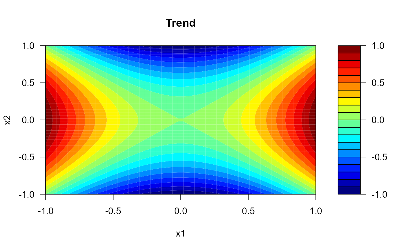
# perspective plot
persp(gdata, main = 'Trend', theta = 40, phi = 20, ticktype = "detailed")
 # filled contour plot
contour(gdata, main = 'Trend', filled = TRUE, color.palette = jet.colors)
# filled contour plot
contour(gdata, main = 'Trend', filled = TRUE, color.palette = jet.colors)
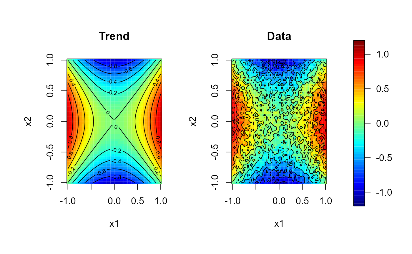
 # Multiple plots with a common legend:
scale.range <- c(-1.2, 1.2)
scale.color <- jet.colors(64)
# 1x2 plot with some room for the legend...
old.par <- par(mfrow = c(1,2), omd = c(0.05, 0.85, 0.05, 0.95))
image(gdata, zlim = scale.range, main = 'Trend', col = scale.color)
contour(gdata, add = TRUE)
image(gdata, 'y', zlim = scale.range, main = 'Data', col = scale.color)
contour(gdata, 'y', add = TRUE)
par(old.par)
# the legend can be added to any plot...
splot(slim = scale.range, col = scale.color, add = TRUE)
# Multiple plots with a common legend:
scale.range <- c(-1.2, 1.2)
scale.color <- jet.colors(64)
# 1x2 plot with some room for the legend...
old.par <- par(mfrow = c(1,2), omd = c(0.05, 0.85, 0.05, 0.95))
image(gdata, zlim = scale.range, main = 'Trend', col = scale.color)
contour(gdata, add = TRUE)
image(gdata, 'y', zlim = scale.range, main = 'Data', col = scale.color)
contour(gdata, 'y', add = TRUE)
par(old.par)
# the legend can be added to any plot...
splot(slim = scale.range, col = scale.color, add = TRUE)